How to Improve Website Conversion Rates A Practical Guide
How to Improve Website Conversion Rates A Practical Guide
Ollie Efez
January 20, 2026•20 min read•Updated Apr 16, 2026
Improving your website’s conversion rates isn’t about guesswork or randomly testing button colors. It's a methodical process of figuring out why people are leaving, and then running smart, targeted experiments on things like your calls-to-action, copy, and forms to fix the underlying problem.
It’s all about moving from hunches to data-backed decisions that actually grow your business.
Your Starting Point: Finding Conversion Bottlenecks
Before you can fix a leaky bucket, you have to find the holes. Too many teams get excited and jump straight into A/B testing headlines or button designs without a clear problem to solve. That's a classic mistake. Real conversion optimization always starts with a diagnostic phase—a deep dive to find out exactly where and why potential customers are giving up.
This process is all about combining two kinds of information: the hard numbers and the human stories.
Marrying Analytics with User Behavior
Your first stop should always be your analytics platform, like Google Analytics. This is where you uncover the "what." You’re on the hunt for pages with suspiciously high exit rates or specific points in your funnel where users just vanish.
For example, you might discover that a staggering 80% of users who start your signup process bail on the second step. That’s a massive red flag, but the numbers alone don't tell you why.
That's where qualitative tools like Hotjar or FullStory come in. They provide the crucial "why" behind the data through:
- Heatmaps: These are visual maps showing where people click, move their mouse, and how far they scroll. You might see a dozen people clicking on an image that isn't a link, instantly highlighting a confusing design element.
- Session Recordings: Watching anonymized videos of real user sessions is like looking over their shoulder. You get to see their frustration in real-time as they struggle with a confusing form or completely miss a critical CTA.
The real goal here isn’t just to collect data; it's to build empathy. When you watch someone rage-click a broken button, you stop thinking about abstract metrics and start focusing on solving a real person's problem.
Mapping the User Journey to Pinpoint Leaks
To put your findings into context, you need to map out your main user journey. For a typical SaaS business, it looks something like this:
- Awareness: A user lands on your homepage or a blog post.
- Interest: They check out your features or pricing page.
- Consideration: They begin the free trial signup process.
- Conversion: They finish signing up and enter your onboarding flow.
By analyzing the data for each stage, you can quickly spot the weakest link in the chain. Maybe your homepage has a great bounce rate, but you see a massive drop-off between the pricing page and the signup form. Now you know exactly where to focus your attention.
The point of this diagnostic work is to create a list of specific, observable problems—not vague guesses.
For example, instead of saying, "our signup form is bad," your diagnosis becomes, "session recordings show users on mobile devices struggle to tap the 'Next' button because it's too close to the navigation bar." That level of detail is what you need to form a strong, testable hypothesis.
Understanding these metrics is the foundation of any good optimization strategy. To make sure your efforts are both accurate and actionable, it helps to dig into the fundamentals, which you can do by exploring our guide on what is conversion tracking. This knowledge sets you up for successful experiments down the line.
To help you get started, here’s a quick reference table for the most important diagnostic metrics and what they're telling you.
Key Diagnostic Metrics and What They Tell You
Using these metrics as your guide, you can move from broad assumptions to targeted, data-informed hypotheses about what to test and why.Building a Smarter CRO Game Plan
Okay, you’ve done the diagnostic work. You’ve sifted through analytics, watched session replays, and now you’re staring at a monster list of potential website issues. The temptation to just start fixing things at random is real. We’ve all been there, throwing changes at the wall to see what sticks.
But that’s a recipe for wasted time and mixed results. Instead, you need a structured game plan to focus your energy where it’ll actually make a difference.
This is where a prioritization framework becomes your secret weapon. It’s how you turn that messy, overwhelming list of ideas into a clear, strategic roadmap for boosting your conversion rates.
Prioritizing Your Experiments
One of the most effective methods I’ve seen in practice is the PIE framework. It’s simple, fast, and forces you to grade each potential test against three practical criteria:
- Potential: How much of an improvement can this realistically deliver? Fixing a broken checkout button on your highest-traffic page has massive potential. Tweaking the color of a footer link? Not so much.
- Importance: How valuable is the traffic hitting this page? Optimizing your pricing page, where high-intent visitors are making a buy-or-bounce decision, is far more important than a blog post from five years ago.
- Ease: How hard is this going to be to implement? Changing headline copy is a quick win. A complete overhaul of your user onboarding flow is a major project.
You score each idea on a scale of 1-10 for each category, and just like that, you can spot the low-hanging fruit—the high-impact, low-effort changes that deliver early wins. Those wins are critical for building momentum and getting buy-in for your entire CRO program.
Your goal isn't to test everything. It's to test the right things. A good framework ensures you're spending your time and budget on experiments that can actually move the needle on your most important metrics.
This simple process is all about discovering where to focus your efforts for the biggest possible return.
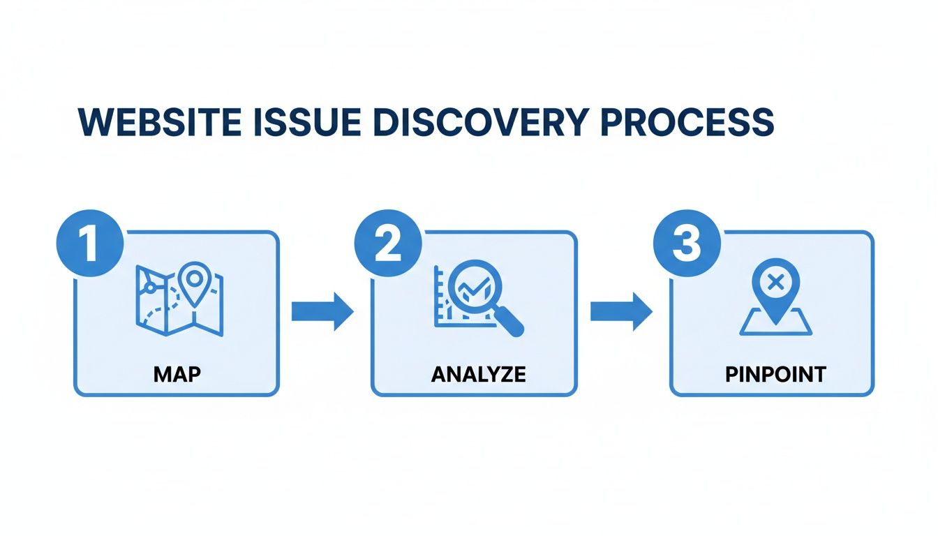
This visual nails the core discovery process: mapping the user journey, digging into the data, and pinpointing the exact friction points. All of that critical info feeds directly into your prioritization framework.
Formulating a Strong Hypothesis
Once you know what to test, you need to define why. Every experiment needs a strong, clear hypothesis. A weak hypothesis like, "Changing the button will improve conversions," is just a shot in the dark. A strong one gives your test structure and a clear reason for being.
A solid hypothesis follows a simple formula: If I [change X], then [outcome Y] will happen, because [reason Z].
Let’s use a real-world example. Imagine you’ve noticed in session recordings that users seem to hesitate on your demo request page.
- Weak Hypothesis: "A new CTA will get more demos."
- Strong Hypothesis: "Changing our CTA from 'Submit' to 'Get My Free Demo' will increase form submissions by 15% because it clarifies the immediate value and reduces user anxiety about what happens next."
See the difference? This structure forces you to think critically about why you believe a change will work. It makes your tests more strategic and your learnings more valuable—even if an experiment doesn't lift conversions the way you expected.
High-Impact Areas for Early Wins
While every SaaS website has its own unique quirks, I’ve found that some areas consistently offer the best potential for quick conversion boosts. As you build out your game plan, think about starting with these high-leverage elements:
- Headlines and Value Propositions: Does your main headline immediately answer "What is this?" and "Why should I care?" Make sure it’s crystal clear and speaks the same language your ideal customers use.
- Calls-to-Action (CTAs): Vague CTAs like "Learn More" or "Submit" create friction because they’re ambiguous. Be specific and action-oriented. "Start My 14-Day Free Trial" or "Download the Guide" leave no room for doubt.
- Trust Signals: Are your customer logos, testimonials, and security badges clearly visible right where people are making decisions? Placing these trust signals next to a CTA or payment form can make a huge difference in reducing hesitation.
Focusing on these areas first helps you build a strong foundation of clarity and trust, which is absolutely essential for guiding users toward that final conversion goal. As you refine your strategy, it’s also smart to look at platform-specific tactics. For instance, if your site is built on Webflow, checking out some of the top conversion rate optimization strategies for Webflow can give you ideas tailored to that environment.
With a prioritized list and strong hypotheses in hand, you're officially ready to start testing.
Executing High-Impact A/B Tests That Get Results
You've done the deep dive into your analytics and user feedback. You have a prioritized list of smart, data-backed ideas. Now for the fun part: moving from planning to action. This is where you put your best hypotheses to the test and let your audience's behavior tell you what really works.Running clean, effective A/B tests is the engine of any serious CRO program. The goal isn't just to launch tests; it's to gather reliable data that leads to confident, revenue-driving decisions. That means setting up your experiments the right way from the get-go.

Setting Up Your A/B Tests for Success
Getting the technical side of A/B testing running is pretty straightforward these days. Tools like VWO, Optimizely, or the testing features in Google Analytics 4 make it simple to create a "variation" of your original page (the "control") and split your traffic between them.But any tool is only as good as the strategy behind it. The most critical piece of the puzzle is making sure your results are statistically significant.
This is just a fancy way of saying you have mathematical confidence that your results aren't a fluke. The industry-standard goal is 95% confidence before you declare a winner. Hitting this number prevents you from overhauling your pricing page based on a random lucky streak.
A classic rookie mistake is calling a test the second one variation pulls slightly ahead. Early results can be wildly misleading. You have to let the test run its course—usually at least one full week or a complete business cycle—to gather enough data for a reliable conclusion.
Building a Clear Measurement Plan
Before you even think about launching a test, you need to define exactly what a "win" looks like. A simple measurement plan is your North Star, keeping the experiment focused and ensuring you're tracking the right metrics. It's not just about the primary conversion, either. You have to watch out for unintended side effects.Maybe that killer new headline increases trial sign-ups (your primary goal), but what if it also tanks demo requests (a secondary metric)? You need the full picture to understand the true impact.
Here's a simple framework I use to structure every test. It keeps everyone on the same page and forces clarity from the start.
Sample A/B Test Hypothesis and Measurement Plan
This template helps structure your A/B tests, ensuring you have clear goals and a precise way to measure the outcome. This structure ensures every single test is tied to a purpose and a measurable outcome. It’s this kind of rigor that separates winning CRO programs from those that just spin their wheels.Common A/B Testing Mistakes to Avoid
Running tests is easy. Running good tests that you can trust is much harder. I've seen countless teams fall into the same traps that invalidate their results and send them down the wrong path.Here are a few of the big ones to watch out for:
- Testing Too Many Things at Once: This is the most common mistake. If you change the headline, the button color, and the main image in one test, you'll have no idea which element actually made the difference. Stick to testing one significant change at a time.
- Ignoring Segmentation: The overall result might look flat, but what about specific segments? Dig into the data. Did the variation crush it for mobile users? For new visitors from a specific ad campaign? The real gold is often buried in these segments.
- Forgetting to Test Your Control: Before you do anything else, run an A/A test. That means splitting traffic between two identical versions of your page. If the results aren't almost identical, it means your testing tool is broken or there's a technical issue skewing your data. Fix that first.
By sidestepping these common pitfalls, you ensure the data you're collecting is clean, reliable, and—most importantly—actionable.
For a deeper dive into strategy, check out these conversion rate optimization best practices that can help guide your testing roadmap. And if you're looking to get more advanced, this a detailed guide on multivariate vs. A/B testing is a fantastic resource for choosing the right approach for your goals.
From Mobile First to Personalization: Optimizing for Every Visitor
Having a flawless desktop experience is just table stakes today. It’s no longer enough. Your visitors are swiping, tapping, and clicking on a dozen different devices, and if your website stumbles on any of them, you’re straight-up leaving money on the table. Optimizing for every visitor means looking beyond a single screen and truly embracing a mobile-first mindset.
The data paints a really clear picture here. While mobile traffic often dominates, conversion rates on desktops and tablets frequently blow smaller screens out of the water. This gap isn't a user problem; it's an experience problem. A clunky mobile interface, tiny buttons you can't tap, or a form that’s impossible to fill out with your thumbs are guaranteed conversion killers.

Creating a Frictionless Mobile Journey
To boost your website's conversion rates, you have to make the mobile experience feel completely effortless. Every single tap should be intuitive, and every piece of information needs to be easy to digest on the go. You need to start analyzing your mobile user journey with the same intensity you apply to your desktop version.
Here are a few high-impact areas to zero in on first:
- Design for Thumbs: Put your most important CTAs and navigation elements in the "thumb zone"—that easy-to-reach area at the bottom and center of the screen. This simple ergonomic tweak can dramatically cut down on interaction friction.
- Simplify Your Forms: Nobody enjoys typing out their life story on a tiny keyboard. Cut your forms down to the absolute essentials. If you can get the information later, do it. Studies have shown that reducing form fields from five to just three can boost submissions by over 25%.
- Boost Page Speed: Mobile users are notoriously impatient. A slow-loading site is one of the top reasons for abandonment. Compress your images, minify your code, and look into technologies like Accelerated Mobile Pages (AMP) to make your site load almost instantly.
Your goal is device parity. A visitor should have an equally amazing experience whether they’re on a 27-inch monitor at their desk or a 6-inch smartphone on the bus. Anything less is a leak in your conversion funnel.
Beyond Mobile: Personalizing the Experience
Once your site is flawless on every device, the next frontier is personalization. This is where you move beyond a one-size-fits-all approach and start delivering content and offers tailored to individual user behavior, location, or even their traffic source.
For instance, you could show a different headline to a visitor who clicked through from a specific ad campaign, making sure your messaging perfectly matches their initial intent. Or, you might offer a special discount only to returning visitors who have previously abandoned their cart. It’s about making every interaction feel relevant.
Making Every Click Count Across Devices
Mobile optimization is a massive lever for improving website conversion rates, and the global e-commerce data backs this up. Desktops and tablets consistently outperform mobile in conversions, even as mobile shopping continues to climb. In some regions, conversion rates on larger screens can be up to 1.5x higher.
For a SaaS platform like LinkJolt, this underscores just how critical it is to ensure affiliate portals and referral trackers are fully responsive. A key tactic here is to relentlessly cut down form fields; as we've seen, 3-field forms convert significantly better than longer ones, which is vital for demo requests and affiliate sign-ups happening on mobile. You can read more about these global conversion rate trends on Statista.
By meeting users where they are—and delivering a tailored, seamless experience on every device—you prevent frustration and capture every possible conversion.
Leveraging Affiliates to Drive High-Quality Traffic
While optimizing on-site elements like CTAs and forms is a must, one of the biggest levers for improving website conversion rates is pulled before a visitor even lands on your page. A well-run affiliate program is so much more than a traffic source. It’s a conversion engine that delivers a steady stream of pre-qualified, high-intent visitors who are already primed to buy.
The magic ingredient here is trust.
When a potential customer arrives from a link shared by a blogger, creator, or industry expert they already follow, a huge chunk of the sales pitch is already done. This isn't cold traffic; it's a warm introduction.
Turn Your Affiliates into a Conversion Powerhouse
To really make this work, you have to move beyond just handing out links and hoping for the best. Empowering your affiliates means treating them like an extension of your marketing team, and a platform like LinkJolt can turn this from a manual headache into a scalable growth channel.
It all starts with giving them a professional, branded affiliate portal. Think of this as their central hub where they can track performance in real-time, see their earnings, and grab all the tools they need to succeed. When affiliates feel supported and can clearly see the results of their work, their motivation shoots through the roof.
Here are the absolute essentials to provide:
- Ready-Made Marketing Materials: Give them everything from logos and banner ads to pre-written email copy and social media posts. The easier you make it for them to promote you, the more they will. Simple as that.
- Real-Time Analytics: A clear dashboard showing clicks, conversions, and commissions is non-negotiable. Transparency builds trust and helps them figure out which of their own strategies are hitting the mark.
- Clear Commission Structures: They need to know exactly how and when they get paid. Any ambiguity here is a program killer.
Scaling Your Program with Smart Automation
Trying to manage an affiliate program manually is a fast track to burnout. As you grow, you’ll get completely bogged down tracking sales, calculating commissions, and processing payments. This is where automation becomes a game-changer for improving your conversion rates at scale.
Platforms like LinkJolt are built to handle all that heavy lifting. Features like zero-fee automated payouts integrated with Stripe or Paddle remove the administrative burden entirely. Commissions get calculated and paid out on schedule without you lifting a finger, ensuring your partners are always paid accurately and on time.
Building a successful affiliate program is about removing friction—both for the end customer and for the affiliate promoting you. The smoother the process is for your partners, the more focus they can put on sending you high-quality, convertible traffic.
Another huge bottleneck for growth is finding new partners. Manually hunting for new affiliates is incredibly time-consuming. A discovery marketplace, where you can connect with vetted affiliates, completely flips this dynamic. Instead of you hunting for partners, they can come to you, which dramatically speeds up how quickly you can scale.
The Proven Impact of Referral Traffic on Conversions
The power of affiliate marketing isn't just a theory; the data backs it up. The average website conversion rate across major industries hovers around 2.9%, but referral traffic consistently meets or beats that benchmark. For SaaS businesses using a platform like LinkJolt, the impact is even more pronounced, as targeted B2B referrals often convert at a significantly higher rate. You can explore the full industry breakdown from RoastMyWeb to see how these numbers stack up for yourself.
By automating commissions and providing a marketplace to discover new partners, SaaS businesses can sidestep the long, drawn-out decision-making cycles common in B2B sales. Affiliates deliver pre-qualified traffic with clear intent, and we've seen companies get a conversion lift of 15-20% after launching a structured program.
Ultimately, every click from a trusted affiliate lands on your site with a much higher probability of converting. For more ideas on maximizing this traffic, check out our guide on creating the perfect affiliate marketing landing page.
Your Top Questions About CRO, Answered
Diving into conversion rate optimization always kicks up a few crucial questions. Getting straight, no-nonsense answers can be the difference between a stalled project and a real growth engine. Let's tackle the most common questions we hear from SaaS businesses when they decide to get serious about turning more visitors into customers.
How Long Should an A/B Test Run?
This is probably the first question everyone asks, and the answer isn't just a number you can pull out of a hat. You can't just run a test until it "feels" like you have a winner. A test needs to run long enough to hit statistical significance, which is the gold standard of a 95% confidence level.
This is your proof that the results are actually because of your changes, not just random luck.
In practical terms, you need to let a test run for at least one full business cycle—usually one to two weeks. Why? Because user behavior on a Monday morning can be wildly different from a Friday afternoon. Running the test for a full cycle helps smooth out those daily bumps in traffic and gives you a much more reliable picture. Pulling the plug too early is a classic mistake that leads to acting on bad data.
What Is a Good Conversion Rate?
It’s tempting to look for industry benchmarks, but honestly, they’re often more distracting than helpful. What counts as a “good” conversion rate is completely dependent on your specific situation:
- Your Industry: A B2B enterprise SaaS product is playing a totally different game than a B2C mobile app. Their benchmarks aren't comparable.
- Your Traffic Source: Visitors coming from a hyper-targeted ad are going to behave differently than someone who found you through a random organic search.
- Your Price Point: It's just reality—a $10/month tool is going to see a higher conversion rate than a $1,000/month platform.
Forget about chasing some arbitrary industry average. The only benchmark that matters is your own. A truly "good" conversion rate is one that's consistently getting better, month after month. Your biggest competitor is last month's performance.
How Many Tests Should We Run at Once?
The number of experiments you can juggle at the same time comes down to one thing: your website traffic.
To get trustworthy results without waiting forever, each variation in your test needs enough eyeballs. If you’re dealing with millions of monthly visitors, go ahead—you can run multiple tests on different pages and not break a sweat.
But if you’re a startup or a smaller SaaS company, running too many tests at once will spread your traffic too thin. Each test will take forever to reach statistical significance, and you'll be stuck in analysis paralysis. For most, it's far more effective to focus on one high-impact test at a time. Get it live, learn from the results, and then move on to the next big idea on your roadmap. A sequential, focused approach is how you build real momentum.
Ready to turn more of your website visitors into paying customers? LinkJolt provides all the tools you need to build and scale a high-converting affiliate program, driving high-quality traffic that's ready to sign up. See how LinkJolt works.
Watch Demo (2 min)
Trusted by 300+ SaaS companies
Start Your Affiliate Program Today
Get 30% off your first 3 months with code LINKJOLT30
✓ 3-day free trial
✓ Cancel anytime