Your Guide to Building an Affiliate Marketing Landing Page That Converts
Your Guide to Building an Affiliate Marketing Landing Page That Converts
Ollie Efez
January 17, 2026•19 min read
An affiliate marketing landing page is a standalone web page you build with one goal in mind: turning visitors into customers for a specific offer. Instead of just sending raw traffic straight to a merchant's site, the pros use these pages to control the message, build trust, and warm people up before they ever see the final product page.
It’s your single most powerful tool for cranking up conversions.
Why You Need a Dedicated Affiliate Landing Page

It’s tempting to just grab your affiliate link and start blasting traffic directly to the merchant’s website. It feels like the quickest path to a commission, right? But that’s a rookie move that leaves a ton of money on the table.
The most successful affiliate marketers I know all share a crucial secret: the real conversions happen on a page you control.
A dedicated landing page transforms you from a simple link-forwarder into a trusted advisor. It’s the bridge that warms up cold traffic, presenting the offer through your unique voice and perspective. This isn't just an extra step; it's how you start building a real relationship with your audience.
The Power of a Controlled Narrative
When you send visitors straight to a merchant’s site, you give up all control. Their homepage is built for a general audience, not the specific slice of people you worked so hard to attract. A custom landing page lets you tailor the entire experience from top to bottom.
You get to craft a narrative that speaks directly to your audience's pain points. You can highlight the features you know they’ll care about most and answer their specific questions before they even think to ask them. This is absolutely vital when promoting SaaS products, where a well-crafted page can break down complex features into tangible, easy-to-understand benefits.
This controlled environment lets you pre-sell the visitor, making them far more likely to convert once they finally click your affiliate link. You're not just sending traffic; you're sending an informed, interested prospect who is primed to take action. It's precisely why affiliate marketing boasts an average conversion rate of 2.0% for leads and 1.2% for sales—way higher than standard display ads. If you want to dive deeper, you can explore more data on digital marketing conversion rates to see just how big the impact of targeted traffic is.
By building your own landing page, you’re essentially creating a perfectly optimized sales pitch that works for you 24/7. It’s the difference between handing someone a generic brochure and giving them a personalized recommendation from a friend.
Before we dive into the "how-to," let's quickly summarize the core components we'll be building. This table gives you a quick-glance overview of the essential building blocks of a high-converting affiliate landing page.
Key Elements of a High-Converting Affiliate Landing Page
Each of these elements plays a critical role, and we'll break down exactly how to craft them in the sections to come.Key Advantages of Using a Custom Page
Ultimately, a dedicated page is all about maximizing your efforts. You stop hoping for the best and start engineering a better outcome. Here are the core benefits you'll see right away:
- Increased Trust and Credibility: A professional page with your own branding builds confidence. Visitors are far more likely to trust your recommendation than a raw, sketchy-looking affiliate link.
- Higher Conversion Rates: By focusing on a single offer and removing all distractions—like navigation bars or competing links—you create a clear, frictionless path to conversion.
- Improved Tracking and Optimization: Owning the page means you can install your own analytics, run A/B tests on headlines and calls-to-action, and truly understand what resonates with your audience.
- Audience Building: This is a big one. You can add an email signup form to capture leads, letting you build your own audience and promote other offers down the line. It's how you turn a one-time click into a long-term asset.
Writing Persuasive Copy That Drives Commissions

If your page design gets visitors in the door, your copy is what convinces them to stay and buy. The words you choose are the engine of your conversion machine, turning casual curiosity into clicks and, ultimately, commissions.
Great affiliate copy isn't about hype or aggressive sales tactics. It’s about building a genuine connection, showing undeniable value, and positioning the product as the only logical solution to a very real problem.
Let's break down how to craft copy that truly connects and converts.
Nailing the Headline Your Most Important Asset
Your headline is the first—and often the only—thing a visitor will read. If it doesn’t instantly grab their attention and scream “this is for you,” they’re gone. A weak headline kills your page before it even gets a chance.
Forget generic titles. A powerful headline needs to do one of two things: promise a specific, desirable outcome or poke at a painful problem the product solves.
For instance, a headline like “Get Our SaaS Tool” is completely forgettable. But “Launch Your Entire Affiliate Program in Under 10 Minutes” speaks directly to a desired result and feels urgent. The goal is to make the reader immediately think, "Yes, that's exactly what I need."
Crafting Body Copy That Connects
Once the headline has done its job, the body copy has to deliver on that promise. This is where you shift from being a marketer to being a trusted advisor. Stop listing features. Start telling a story your audience can see themselves in.
Begin by focusing entirely on your visitor’s pain points. What’s their biggest frustration right now? What problem are they desperately trying to solve? When your copy proves you understand their struggle, you instantly build trust.
Your job is to articulate the customer's problem better than they can themselves. When you do that, they will automatically assume you have the solution.
Once you’ve established that connection, you can introduce the affiliate product as the hero of the story. You have to show, not just tell. Instead of saying a SaaS tool is "easy to use," describe how it automates a tedious, mind-numbing task, giving them back hours every week. This transforms a boring feature into a tangible, highly desirable benefit.
Weaving in Social Proof and Authenticity
People are naturally skeptical, especially online. Your personal recommendation is a solid start, but backing it up with social proof is what truly seals the deal. This is your hard evidence that the product actually works for real people.
Here are a few ways to add instant credibility:
- Customer Testimonials: Short, impactful quotes from happy customers are gold. Use specific results whenever you can, like "This tool helped us increase sign-ups by 30% in just one month."
- Case Studies: A brief summary of a customer's journey from problem to solution can be incredibly persuasive, particularly for B2B or SaaS offers.
- "Featured In" Logos: If the product has been mentioned by reputable brands or publications, displaying their logos adds immediate authority.
Your own experience is also a powerful form of social proof. Share a personal story about how the product helped you. This humanizes your recommendation and makes it feel genuine, not just transactional. Understanding the core drivers behind why people trust recommendations is key; you can gain valuable insights into the psychological triggers that drive affiliate conversions and apply them directly to your copy.
The Final Push A Powerful Call to Action
Your call-to-action (CTA) is the final, critical instruction you give your visitor. Weak, passive phrases like "Learn More" or "Click Here" are conversion killers because they lack urgency and clarity.
A great CTA must be direct, benefit-driven, and action-oriented. It should tell the user exactly what they get the second they click.
Weak vs. Strong CTA Examples
Make your CTA button pop. Use a contrasting color that draws the eye and makes it impossible to miss. Place it strategically above the fold and repeat it after key sections so your visitor always knows what the next step is.Designing a Layout That Guides Visitor Action
Persuasive copy is the engine, but your page layout is the road that guides visitors straight to a conversion. Great design isn't about flashy graphics; it's the strategic art of creating a frictionless path from the moment someone lands to the moment they smash that affiliate link.
The goal here is ruthless focus. A high-converting landing page is a minimalist masterpiece with one job and one job only. That means no navigation bar, no sidebar full of other offers, and no external links that don't point directly to your affiliate partner. Every single element must serve a single purpose: moving the visitor toward the call-to-action.
Mastering the Above the Fold Experience
The space a visitor sees without scrolling—"above the fold"—is your most valuable real estate. You have roughly three seconds to convince someone to stick around. This area has to immediately answer three critical questions: Where am I? What can I do here? And why should I bother?
To grab that instant attention, you absolutely need these elements locked in:
- Your Compelling Headline: We've already covered it, but this is your hook. Make it the most prominent text on the page, period.
- A Supporting Subheading: A quick, one-sentence explanation that adds context to the headline and hammers home the main benefit.
- An Engaging Hero Image: A high-quality image or short video that either shows the product in action or represents the dream outcome.
- The Primary Call-to-Action (CTA) Button: It has to be impossible to miss. Use a bright, contrasting color that yanks the eye toward it and makes the next step obvious.
This combination works in concert to create a powerful first impression, validating their click and making them eager to scroll for more.
Using Visual Hierarchy to Direct Attention
Visual hierarchy is the subtle art of arranging elements to signal their importance. It's how you subconsciously tell visitors what to look at first, second, and third. You control this flow with simple design principles.
For instance, use bigger, bolder fonts for headlines and smaller text for the body. Whitespace—the empty space around elements—is just as crucial. It prevents the page from feeling cluttered and helps key components like your CTA button pop. To really nail this, you need to understand the fundamental principles of conversion optimization.
Pro Tip: Think of your page like a guided tour. Your headline is the welcome sign, your copy is the tour guide's script, and your CTA is the grand finale. Every element should lead naturally to the next without any confusing detours.
A Focus on Mobile-First Design
With most affiliate traffic coming from mobile devices, a "mobile-first" approach isn't optional—it's essential. This means you design the experience for the smallest screen first, then adapt it for larger screens like tablets and desktops.
A responsive layout ensures your text is readable, images load correctly, and buttons are easy to tap on any device. Test the page on your own phone. If you have to pinch and zoom to read anything, you've failed. A clunky mobile page is a guaranteed conversion killer. For a deeper dive, our guide on conversion rate optimization best practices has more tips on this.
Simple Wireframes for Common Offers
Often, the simplest designs convert the best. In fact, research shows that clear, simple design choices can lead to massive lifts. Did you know 73% of top-performing pages use human faces to build connection? Or that for SaaS products, simple copy can outperform complex jargon by over 500%? The data is clear: simplicity wins.
Here are two dead-simple layouts that work wonders for most affiliate offers:
- The SaaS Review Page: Start with a headline, a hero shot of the software dashboard, and a CTA. Follow it with a short section on the main problem it solves, bullet points highlighting key benefits, your personal recommendation, and a final, hard-to-miss CTA.
- The Lead Magnet Funnel: The top section needs a headline that screams the value of your free guide or template. Include a simple form to collect an email and a clear CTA button. Keep it short and laser-focused on the value of the freebie.
By keeping your layout clean, focused, and user-centric, you create an environment where clicking your affiliate link feels like the most natural thing in the world.
Setting Up Tracking and Analytics the Right Way
Building a slick, persuasive landing page is a great first step. But if you’re not tracking what happens after someone clicks, you're flying blind. Every decision you make—from the headline you choose to the color of your CTA button—is nothing more than a guess.
Proper tracking is how you turn that guesswork into a data-driven strategy. It’s how top affiliates consistently boost their commissions month after month. The idea is simple: you need to know exactly where your clicks are coming from and what people do once they land on your page. This data is everything.
Demystifying UTM Parameters
The foundation of solid tracking starts with UTM parameters. Don't let the name intimidate you. They're just simple text snippets you tack onto the end of your URLs to tell your analytics tools where your traffic came from. Think of them as little name tags for every link you share online.
When a visitor clicks a link you've tagged with UTMs, that info gets sent straight to your analytics platform, like Google Analytics. Suddenly, you can see which of your social media posts, email campaigns, or paid ads are actually driving valuable traffic and which ones are duds.
A typical UTM-tagged link looks something like this:
yourlandingpage.com/?utmsource=facebook&utmmedium=cpc&utmcampaign=saaspromo
This simple tag tells you the click came from a paid ad (cpc) on Facebook as part of your SaaS promo campaign. Mastering this is non-negotiable for serious affiliates. If you want to go deeper, our complete guide on how to track affiliate links breaks it all down step-by-step.
Connecting the Dots with Analytics Tools
Once your links are tagged, you need a command center to see all that juicy data. Google Analytics is the industry standard and the perfect place to start. Just install its tracking code on your landing page, and you unlock a treasure trove of insights into how people are behaving.
You can immediately start tracking critical metrics like:
- Bounce Rate: What percentage of visitors leave after seeing just one page? A high bounce rate could mean there’s a major disconnect between your ad and your landing page.
- Time on Page: How long are people actually sticking around? If they're spending a good amount of time, it’s a strong signal that your copy is hitting the mark and your offer is compelling.
- Conversion Goals: You can set up specific goals to track how many visitors click your main affiliate CTA button. This gives you a crystal-clear conversion rate for your page.
Modern affiliate platforms built for SaaS, like LinkJolt, often make this even easier. Many have built-in, real-time dashboards that show clicks, conversions, and revenue without needing any complicated external setups. It gives you an immediate pulse on your campaign's health.
Data is what lets you stop guessing and start optimizing. It’s the only way to know with certainty that changing a headline from blue to orange actually increased your click-through rate by 15%.
Making Data-Driven Decisions
With tracking finally in place, you can make smart, informed decisions. Is your traffic from Twitter converting better than Instagram? Time to double down on Twitter. Is one of your headlines causing a huge bounce rate? You know exactly what to A/B test next.
This constant feedback loop is what separates the top-earning affiliates from everyone else. They don’t rely on luck; they use data to systematically improve every single part of their funnel.
Beyond standard analytics, it's also worth exploring specific tools for affiliate link management. These can help you shorten and organize your URLs, which not only looks more professional but also keeps your tracking clean and manageable as you scale. The goal is to build a clear, repeatable process for optimization.
Optimizing Your Page for Speed and Performance
In the world of affiliate marketing, speed isn't just a nice-to-have feature—it’s the bedrock of your conversion strategy. You can have a stunning landing page with killer copy, but if it takes forever to load, it’s all for nothing. Your visitors are impatient, and every millisecond of delay is another potential commission walking out the door.
Aim for a load time of under three seconds. Anything longer, and you start bleeding visitors at a shocking rate. This is especially true on mobile, where users often have less patience and potentially slower connections. A fast page feels professional and respects your visitor's time, making a great first impression before they even read a single word.
Taming Your Image Sizes
One of the biggest culprits behind a slow-loading page is oversized, unoptimized images. That beautiful hero shot might grab attention, but if it's several megabytes, it's bringing your page to a screeching halt. The good news is you don't have to sacrifice quality for speed.
The key is image compression. Modern tools can slash file sizes—often by over 70%—with no noticeable drop in visual quality. Before you upload a single image, run it through a compression tool.
You should also serve images in next-gen formats like WebP, which provides way better compression than old-school JPEGs and PNGs. Many modern page builders and plugins can automatically convert your images for you, giving you the best of both worlds without any extra work.
Leveraging Browser Caching
Browser caching is a simple but powerful technique. It tells a visitor's browser to save certain parts of your website—like images and code—after their first visit. When they come back, their browser loads those saved files from their own computer instead of re-downloading everything from your server.
This dramatically speeds things up for repeat visitors or anyone clicking through multiple pages on your site. Most quality hosting providers and page builders have a simple one-click option to enable this. It’s a low-effort, high-impact tweak you can't afford to skip.
This process is a continuous loop. Optimizing your page's performance isn't a one-and-done task; it's the final, crucial step in a cycle of refinement.
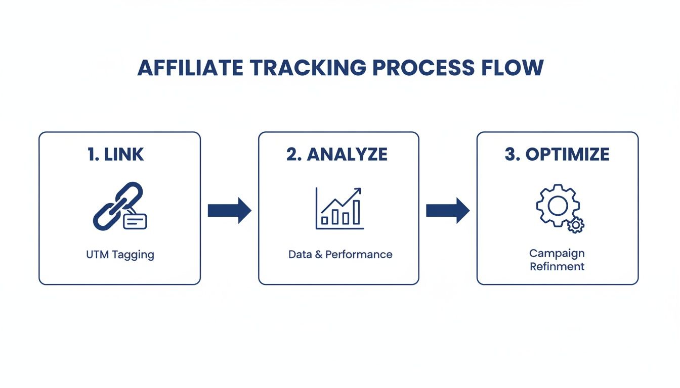
As you can see, the flow from linking to analyzing and optimizing shows that performance is part of an ongoing improvement cycle driven by data.
The Real Cost of Slow Speeds
The impact of page speed on your bottom line is staggering. For every extra second of load time, marketers see a 4.42% drop in conversion rates. This is especially painful in affiliate marketing, where 59% of clicks come from mobile devices, yet mobile conversions still lag behind desktop. To capture those mobile commissions, a lightning-fast, responsive page isn't just an option—it's a requirement. You can learn more about these crucial landing page statistics and see for yourself how they impact earnings.
Remember, the faster your affiliate landing page loads, the higher the chance a visitor stays long enough to see your offer and click your CTA. Even a one-second improvement can directly translate into more commissions.
Here’s a quick performance checklist to get your page ready to convert:
- Compress All Images: Use a tool to shrink file sizes before you upload them.
- Enable Caching: Flip the switch on browser caching via your host or a plugin.
- Choose a Lightweight Builder: Avoid page builders bloated with unnecessary scripts.
- Minimize Scripts: Limit how many third-party tracking scripts or plugins are running on your page.
- Test Your Speed: Use a tool like Google PageSpeed Insights to measure your load time and find bottlenecks.
By making performance a priority from day one, you guarantee that every visitor you send to your page gets the best possible experience, maximizing your opportunity to earn.
Frequently Asked Questions About Affiliate Landing Pages
Even with a great strategy, a few questions always pop up when you’re building your first affiliate landing page. I get these all the time from affiliates who are just starting out or trying to level up their conversions.
Let’s clear up the common sticking points so you can move forward.
Do I Need to Be a Coder to Build a Landing Page?
Absolutely not. Maybe ten years ago, but the game has completely changed. Modern drag-and-drop page builders like Leadpages or Unbounce are built for marketers, not developers.
You can spin up a professional, high-converting page without ever looking at a line of code. These platforms come loaded with templates designed for conversions, which you can easily tweak to fit your brand and the specific offer you're promoting.
Should I Build a Full Website or Just a Single Landing Page?
This is a really important distinction. A full-blown affiliate website is your home base—it might have dozens of reviews, blog posts, and different offers. But an affiliate landing page is a lone wolf. It’s a single, standalone page with one mission: get the visitor to click your affiliate link for one specific product.
When you're running paid ads, email blasts, or targeted social media campaigns, a dedicated landing page will almost always outperform a website. Why? Because it strips away all the distractions. It creates a straight, clean path from your ad right to the action you want the user to take.
The real difference is focus. A website is a library full of different books; a landing page is a single, hard-hitting sales letter for one specific book. When you need immediate action, the sales letter wins every time.
How Much Information Is Too Much?
Your goal is to give the visitor just enough information to be persuaded, and not a single word more. One of the classic mistakes I see is overloading a page with text, a laundry list of features, and technical jargon. This just leads to analysis paralysis.
Keep your copy short and scannable. Use bullet points to hammer home the key benefits and bold text to make sure the most critical takeaways jump off the page. A visitor should be able to grasp your offer in 30 seconds or less. If they have to work to understand what you're selling, you've already lost them.
A great way to solve this is by adding a short FAQ section near the bottom of your page. It’s the perfect spot to address common objections (like pricing or complexity) without cluttering up your main sales pitch. This keeps the primary flow clean but still gives the more detail-oriented visitors the answers they're looking for.
At LinkJolt, we build the tools to not only manage your entire affiliate program but also to track the performance of every single landing page you create. See how our real-time analytics can help you optimize your campaigns by exploring our platform.
Watch Demo (2 min)
Trusted by 300+ SaaS companies
Start Your Affiliate Program Today
Get 30% off your first 3 months with code LINKJOLT30
✓ 3-day free trial
✓ Cancel anytime