What Is a Marketing Dashboard and How Does It Work?
What Is a Marketing Dashboard and How Does It Work?
Ollie Efez
December 12, 2025•19 min read

A marketing dashboard is your entire marketing operation, visualized on a single screen. It pulls all the critical data from different channels—like Google Ads, social media, and email campaigns—into one clear, easy-to-read command center.
Think of it as the digital cockpit for your business. It's built to help you monitor performance, spot trends, and make smarter decisions without getting hopelessly lost in a dozen different spreadsheets.
Your Marketing Command Center Explained
Imagine trying to fly a plane without any instruments. You’d have no idea about your speed, altitude, or direction. That chaotic, guesswork-driven flight is exactly what running a marketing campaign without a dashboard feels like.
A dashboard’s main job is to cut through that chaos. Instead of logging into Google Analytics, then Meta Ads, then your email platform, a dashboard brings all that fragmented information together into a single, unified view. It's built to answer the most fundamental question you have: "What's happening right now across all my marketing?"
The Core Purpose of a Dashboard
At its heart, a marketing dashboard solves a massive problem. A recent study found that nearly 70% of marketing leaders struggle to measure campaign ROI, and two-thirds can't clearly show their impact to stakeholders. This often leads to delayed budgets and inefficient spending. You can learn more about these marketing dashboard market findings on dataintelo.com.
A good dashboard makes your performance visible and understandable, directly tackling that challenge. It’s not just a random collection of charts; it’s a strategic tool designed to do three specific jobs that give you clarity and control.
A dashboard moves you from being reactive to proactive. It turns overwhelming data into actionable signals, allowing you to stop guessing what works and start knowing.
These three functions are the foundation of any effective dashboard, whether you're tracking daily ad spend or monitoring long-term brand growth. They work together to paint a complete picture of your marketing health.
Here’s a simple breakdown of what a dashboard really does for you:
Core Functions of a Marketing Dashboard
Ultimately, the goal is to replace clunky, time-sucking manual reports with an automated, at-a-glance view. This simple shift frees up your team to focus on strategy and optimization instead of getting bogged down in data collection.The Building Blocks of a Powerful Dashboard
Every great marketing dashboard is built from the same basic parts. Think of it like cooking a fantastic meal: you have your individual ingredients (the metrics) and the final, impactful dish you serve (your KPIs). Knowing how to combine them is what separates a confusing chart from a dashboard that actually drives growth.
The first step is getting clear on the difference between a metric and a Key Performance Indicator (KPI). A metric is just a data point—it measures something. A KPI, on the other hand, is a specific metric you’ve tied directly to a critical business goal.
This diagram breaks down how a dashboard’s functions—tracking, analyzing, and reporting—create a clear path for turning raw data into smart decisions.
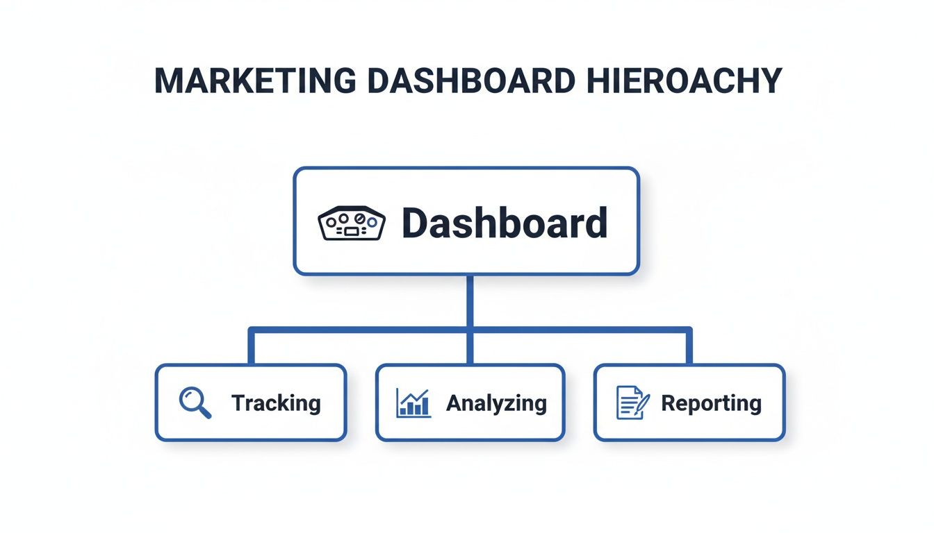
It shows that a dashboard is much more than a collection of charts; it’s a system for turning numbers into action through a structured process.
Metrics vs. KPIs: A Quick Example
Imagine you got 10,000 website visits this month. That's a metric. It’s a number, and it’s good to know, but it doesn't really tell you if your business is winning or losing.
Now, let's say your main goal is to grow your customer base profitably. A powerful KPI would be your Customer Acquisition Cost (CAC). That single number tells you exactly how much you're spending to land each new customer, directly connecting your marketing spend to a bottom-line financial outcome. That’s a KPI.
A dashboard cluttered with vanity metrics like page views or social media followers can paint a dangerously misleading picture. A truly effective dashboard cuts through the noise and prioritizes KPIs that tell the real story about your performance and business health.
Choosing KPIs That Actually Matter
The right KPIs are completely dependent on your goals. A social media manager trying to build community and a paid ads specialist focused on ROAS will need to track entirely different things to know if they're succeeding. The whole point is to pick indicators that help you make better, faster decisions.
For a deeper look at this, our guide on how to measure marketing effectiveness offers a complete framework.
Here are a few essential KPIs, broken down by marketing function:
- Lead Generation: You need to focus on pipeline health. Track your Marketing Qualified Leads (MQLs), Sales Qualified Leads (SQLs), and, most importantly, the MQL-to-SQL conversion rate.
- Website Performance: Go beyond basic traffic numbers. Your key indicators are Conversion Rate (the percentage of visitors who take a desired action), Bounce Rate, and Average Session Duration.
- Paid Advertising: It all comes down to financial efficiency. Prioritize KPIs like Return on Ad Spend (ROAS), Cost Per Click (CPC), and Cost Per Acquisition (CPA).
- Email Marketing: This is about engagement. Measure your Click-Through Rate (CTR), Open Rate, and Unsubscribe Rate to see what’s resonating with your audience.
The real magic happens when you bring data from all these channels together. Modern dashboards don’t just show you isolated numbers; they connect your Shopify sales data with your Meta ad spend and your Google Analytics traffic to create a single source of truth focused on revenue. This unified view is what allows for sharp, data-backed decisions—like reallocating budget based on which keywords are most profitable or which geographic areas are performing best. For marketers aiming to make agile adjustments, leveraging real-time engagement tracking dashboards is a game-changer.
Why a Marketing Dashboard Is a Game Changer
Knowing what a dashboard is made of is one thing, but seeing the impact it can have is what really matters.
Without a centralized dashboard, most marketing teams are drowning in data. They spend hours upon hours manually pulling reports from a dozen different platforms, just to stitch together a fragmented picture of what’s going on. This old way of working is slow, riddled with errors, and makes proactive decision-making feel like a distant dream.
Think about a growing company before it gets a dashboard. The team is busy, running campaigns on social media, search, and email. Every Monday morning, the marketing manager sinks four hours into exporting data into spreadsheets, desperately trying to piece together what worked last week. By the time the report is finally done, the data is already old news, and a massive opportunity might have slipped through the cracks.
From Chaos to Clarity
Now, let's picture that same company after getting a real marketing dashboard. That Monday morning reporting fire drill? Gone. Instead, everyone on the team has a live, automated view of performance right at their fingertips.
A marketing dashboard transforms your team from reactive data collectors into proactive strategists. It replaces guesswork with certainty, allowing you to make fast, confident decisions that directly move the business forward.
This shift isn't just a small improvement; it fundamentally changes how a marketing team operates and creates a truly data-driven culture.
- Massive Time Savings: Automated dashboards completely eliminate manual reporting. It’s not uncommon for teams to burn 10-20 hours per week on this task alone. A dashboard hands that time back, letting marketers focus on actual strategy and optimization instead of tedious data entry.
- Faster, Smarter Decisions: With data in real time, you can spot trends and fix problems the moment they happen. If a campaign’s cost per lead suddenly doubles, you’ll know right away and can jump on it—instead of finding out a week later when the damage is done. This agility saves your budget and helps you capitalize on opportunities as they emerge.
- Improved Team Accountability: When goals and KPIs are displayed on a shared dashboard for everyone to see, it creates a powerful sense of alignment and ownership. Each person can see exactly how their work contributes to the bigger picture, fostering a culture where everyone is accountable for the results.
Proving Your Impact with Confidence
Ultimately, the biggest win is the ability to connect your marketing activities directly to business outcomes. A well-built dashboard clearly shows your impact on the bottom line, making it infinitely easier to justify your budget and prove your team's value to leadership. It helps you answer the most important question of all: "Is our marketing actually making money?"
By tracking the entire customer journey, you can pinpoint which channels are bringing in the most valuable customers. This is the kind of insight that’s absolutely essential for understanding your financial performance. To dig deeper, check out our guide on how to calculate marketing ROI—it pairs perfectly with the data you'll get from your new dashboard.
Dashboard Examples for SaaS and Affiliate Marketers
Theory is great, but seeing a marketing dashboard in the real world is where it all clicks. The beauty of a good dashboard is its flexibility—it’s not a one-size-fits-all tool. It’s a mirror that reflects the unique story of your business model.
What a subscription software company obsesses over is worlds away from what an affiliate program manager needs to track. Let's break down two practical examples to show you what this looks like in action.

The SaaS Customer Lifecycle Dashboard
For any Software-as-a-Service (SaaS) business, the entire game revolves around two things: acquiring new customers and keeping them happy for as long as possible. A SaaS dashboard is built to monitor the health of its subscription revenue and customer loyalty. It’s far less about one-time sales and much more about long-term value.
This dashboard visualizes the entire customer journey, from the moment they sign up to the point they might consider leaving.
A great SaaS dashboard answers critical questions at a glance: Is our recurring revenue growing? How much is each customer really worth? And are we losing subscribers faster than we're gaining them?
The essential KPIs you’d find front and center on this kind of dashboard include:
- Monthly Recurring Revenue (MRR): The lifeblood of any subscription business. This isn’t just revenue; it's predictable revenue, showing you whether you’re growing or stagnating month over month.
- Customer Lifetime Value (CLV): This KPI forecasts the total revenue you can expect from a single customer over their entire relationship with you. It’s the metric that justifies your marketing spend.
- Churn Rate: The percentage of subscribers who cancel their plans within a given period. Keeping this number as low as humanly possible is a primary goal for the entire company.
- Customer Acquisition Cost (CAC): The total sales and marketing cost required to land one new customer. The golden rule is to keep your CAC significantly lower than your CLV.
This focused view helps the team make smart, fast decisions about where to invest, which features to promote, and how to stop customers from walking out the door.
The Affiliate Program Performance Dashboard
Now, let's switch gears and put on the hat of an affiliate program manager. Their job isn’t to track MRR or churn. Their world is all about monitoring and optimizing the performance of their marketing partners. An affiliate marketing dashboard is the command center for managing dozens, or even hundreds, of individual affiliates.
The core purpose here is to see which partners are driving real results and who might need a little more support to succeed. For a look at the tools used to build these kinds of powerful dashboards, you can check out platforms like Databox, a popular marketing dashboard tool.
Key KPIs for an affiliate manager's dashboard would be:
- Clicks: The total number of clicks generated by all affiliate links. This gives you a baseline for overall traffic volume and partner activity.
- Conversion Rate: The percentage of clicks that turn into a desired action, like a sale or a sign-up. This is the ultimate measure of traffic quality.
- Top Performing Affiliates: A leaderboard showing which partners are generating the most conversions and revenue. This tells you who your superstars are.
- Total Commissions Paid: This tracks the total payout to affiliates, helping you manage the program's budget and calculate its overall ROI.
By tracking these specific metrics, an affiliate manager can quickly identify their most valuable partners, spot underperforming links, and fine-tune their program for maximum profitability. Both examples show how a well-designed dashboard delivers clarity, no matter what you're selling.
Key KPIs for SaaS vs. Affiliate Marketing Dashboards
To make the distinction even clearer, let's put the most important metrics side-by-side. Notice how SaaS is focused on internal, long-term customer value, while affiliate marketing is centered on external partner performance and immediate conversions.
This comparison highlights why dashboard customization is so critical. A generic template just won't cut it; your dashboard needs to speak the language of your specific business model to provide truly actionable insights.How to Design a Dashboard That Actually Gets Used
Let's be honest: a powerful marketing dashboard is completely useless if nobody on your team actually wants to look at it. Great design isn't about flashy colors or packing in every chart imaginable. It’s about creating instant clarity and answering the most important business questions at a single glance. The goal is to build a tool that feels intuitive, not like another piece of software people have to be forced to learn.
The single most important rule is to design for your audience. A CEO doesn't need to see the click-through rate of a specific ad variation. They need a high-level, 30,000-foot view of metrics like Customer Acquisition Cost (CAC) and overall marketing ROI. A campaign manager, on the other hand, lives in the weeds and needs that granular, real-time data to make quick optimization decisions.

Tell a Story with Your Data
Your dashboard should tell a clear story, not just throw a bunch of random numbers on the screen. This comes down to choosing the right visualizations to communicate insights effectively. Don't just pick a chart because it looks cool; pick the one that best answers the question you're asking.
- Line charts are perfect for showing trends over time, like tracking website traffic growth month-over-month.
- Bar charts excel at comparing different categories, such as the performance of several ad channels side-by-side.
- Scorecards are your go-to for highlighting the most critical, single KPIs, like total MRR or current ROAS.
A dashboard isn't a static report you print once a month; it's a living, breathing tool. The metrics that matter today might not be the ones that matter next quarter. Revisit and refine your dashboard regularly to make sure it evolves with your business goals and continues to provide real value.
Prioritize Simplicity and Context
Clutter is the absolute enemy of clarity. A crowded dashboard with dozens of competing metrics is overwhelming and, eventually, gets ignored. Focus on a handful of KPIs that truly drive your business forward and resist the temptation to include every single metric you can find. A clean layout with plenty of white space lets the most important data breathe and stand out.
But numbers on their own are pretty much meaningless. Context is everything. A conversion rate of 3% doesn't tell you much until you know that last month it was 1.5%. You should always include comparisons—whether it's against a previous period, a specific goal you've set, or an industry benchmark.
Finally, give your team the power to explore by making the dashboard interactive. Adding simple filters for date ranges, campaigns, or channels allows users to dig deeper and answer their own follow-up questions. This simple step turns the dashboard from a static picture into a dynamic analytical tool that actually gets used to make smarter decisions.
How to Build Your First Marketing Dashboard
Alright, let’s move from theory to action. Building your first marketing dashboard is far more achievable than you might think, and you don't need a massive budget or a data science degree to get it done. The journey starts with a single decision: choosing one of three common paths, each with its own balance of cost, power, and ease of use.
The market for the tools that power these dashboards is absolutely booming. It’s expected to jump from USD 7.12 billion in 2025 to USD 13.04 billion by 2030, which tells you everything you need to know about the shift toward accessible, cloud-based data solutions. You can dig deeper into these marketing dashboard market trends if you're curious, but the bottom line is you have more options than ever.
Choose Your Starting Point
The first choice you need to make is how you're going to pull this all together. Each of these three routes serves a different need, from getting a quick snapshot to building a fully customized command center.
- Use Native Analytics Platforms: The path of least resistance is to simply use the tools you already have. Platforms like Google Analytics, Meta Ads, and your email software all come with their own built-in dashboards. They won't pull in data from other sources, but they're free, familiar, and perfect for getting a quick health check on a single channel.
- Adopt Dedicated Dashboard Software: This is the sweet spot for most marketers. Tools like Google Looker Studio (which is free!), Tableau, or Databox are built specifically to connect to multiple data sources. They use pre-built connectors to pull all your marketing data into one place, making setup surprisingly straightforward.
- Build a Custom Solution: This is the "build your own house" option. Large companies with unique data needs and in-house developers often go this route for ultimate control. It offers limitless flexibility but comes with the highest cost and the longest timeline by far.
For most marketers, dedicated software like Google Looker Studio offers the best of all worlds. It’s powerful enough to give you that single pane of glass view without the intimidating learning curve or high cost of a custom build.
A 5-Step Guide to Your First Dashboard
Let's walk through a simple, actionable plan using a free tool like Looker Studio. Following these steps will give you a functional, no-frills dashboard that you can build on over time.
- Define Your Core Question: Don't start by hooking up data sources. Start with a question. What's the one thing this dashboard absolutely must tell you? A great example is: "Which of my marketing channels is driving the most qualified leads?"
- Connect Your Primary Data Sources: Now you can bring in the data. Start small by connecting your most critical platforms. Linking Google Analytics (for website behavior) and Google Ads (for paid performance) is a classic starting point. Most dashboard tools make this a simple, click-to-authorize process.
- Select 3-5 Key KPIs: Fight the urge to track every metric under the sun. Based on the question you defined in step one, pick a handful of KPIs that actually answer it. Good starters are Total Conversions, Cost Per Conversion (CPA), and Conversion Rate broken down by channel.
- Visualize Your Data: This is the fun part. Start dragging and dropping widgets to build your view. Use big, bold scorecards for your main KPIs, a time-series line chart to spot trends, and a simple bar chart to compare channel performance side-by-side. Keep it clean and uncluttered.
- Add Context and Share: Finally, add filters so you can segment your data by date range or specific campaigns. To make this work, you need consistent campaign naming, which is where UTM parameters are crucial. If you need a refresher, check out this guide on how to generate a UTM link. Once you’re happy with it, share the link with your team and start turning those insights into action.
Got Questions? We've Got Answers
Even after getting the basics down, a few questions always seem to pop up about marketing dashboards. Let's tackle the most common ones so you can move forward without any confusion.
What’s the Difference Between a Dashboard and a Report?
This is a classic, and the easiest way to think about it is with a car analogy.
Your dashboard is the speedometer—it's live, dynamic, and tells you what's happening right now. It's built for quick glances and immediate action. "Are we overspending on this ad campaign today?" The dashboard has the answer.
A report, on the other hand, is the trip summary you get after you've reached your destination. It’s a static look back at a specific period—like last week, last month, or last quarter—designed for deep analysis. It answers the question, "How did we perform, and what did we learn?"
They aren’t enemies; they’re partners. You use the live dashboard to steer day-to-day, and the detailed report to plan your next big road trip.
How Often Should I Check My Marketing Dashboard?
There’s no magic number here. The right answer depends entirely on your role and what you're tracking. A simple rule of thumb: check it as often as you need to make a timely decision.
- Daily: This is non-negotiable for anyone running fast-moving paid campaigns. Ad spend, CPC, and conversion rates can change in hours, and a daily check-in is your first line of defense against wasted budget.
- Weekly: This is a great rhythm for tracking broader trends like organic traffic, lead generation, or overall channel health. It gives you enough data to see patterns without getting lost in daily noise.
- Monthly: This cadence is perfect for the big-picture KPIs that take time to mature, like Customer Lifetime Value (CLV) or brand sentiment. These metrics don't change much day-to-day, so a monthly review is more meaningful.
The goal is to build a routine. Make checking your dashboard a habit, and it will quickly become your most trusted guide.
Your marketing dashboard is a living tool, not a static document. Its value comes from regular interaction. Make checking it a habit, and it will become your most reliable guide for strategic adjustments.
Can I Have More Than One Marketing Dashboard?
Not only can you, you absolutely should. In fact, trying to build one single, all-powerful dashboard that serves everyone is a classic rookie mistake. The result is usually a cluttered mess that helps no one.
The best practice is to create specialized dashboards tailored to specific roles or goals. Everyone gets the exact data they need, without the overwhelming noise.
For instance, you might have:
- An Executive Dashboard: Just the high-level stuff—overall marketing ROI, Customer Acquisition Cost (CAC), and progress toward quarterly goals.
- A Paid Media Dashboard: The nitty-gritty for your ad specialists—ROAS, CPC, and conversion rates broken down by campaign and creative.
- A Content Marketing Dashboard: Everything your content team needs—organic traffic, new keyword rankings, top-performing articles, and lead magnet conversions.
This approach makes the data far more actionable and ensures that every person on the team is focused on the metrics that matter most to their job.
Ready to build a dashboard that drives growth for your affiliate program? LinkJolt provides a real-time analytics suite to track every click, conversion, and commission with total clarity. Manage your affiliate program effortlessly with LinkJolt.
Watch Demo (2 min)
Trusted by 300+ SaaS companies
Start Your Affiliate Program Today
Get 30% off your first 3 months with code LINKJOLT30
✓ 3-day free trial
✓ Cancel anytime