Ultimate Guide: Landing Page for Affiliate Marketing Success
Ultimate Guide: Landing Page for Affiliate Marketing Success
Ollie Efez
September 20, 2025•17 min read
One of the biggest mistakes I see affiliates make is sending traffic straight to the merchant's offer page. It seems like the most direct path to a commission, but it's actually a shortcut that costs you control, trust, and ultimately, a ton of money.
Think of it this way: a dedicated landing page is the bridge between your audience and the product. It’s the single most important asset that separates amateur affiliates from the pros who consistently pull in serious commissions.
Why Direct Linking Is a Dead End for Commissions
When you're just starting out, it feels efficient to grab your affiliate link and push traffic—whether it's from ads or your blog—right to the sales page. Fewer clicks, right? The problem is, this skips the most critical part of any sale: warming up the prospect.
Sending someone directly to a generic offer page is like sending a stranger to a party without an introduction. They land cold, without any context from you, the person they trusted enough to click the link in the first place. You completely lose control of the story. The messaging isn't yours, the user experience is out of your hands, and the whole thing feels disconnected. This almost always leads to confusion, a quick click of the "back" button, and dismal conversion rates.
The Real Power of a Pre-Sell Page
Your own landing page is your personal sales rep, working 24/7. It's a clean, focused space where you call the shots.
Here's what it lets you do:
- Build Real Trust: You get to use your own voice and brand to connect with people. It’s your recommendation, not just a random product page.
- Warm Up Your Traffic: You can educate visitors about the problem first, making them eager for the solution you're about to present.
- Filter for Quality: A good landing page ensures only the people who are genuinely interested will click your affiliate link. This sends higher-quality, more motivated traffic to the merchant, which they love and which makes you more money.
This isn't just an affiliate trick; it's a fundamental marketing strategy. In 2023, a study found that 43.6% of businesses were using landing pages specifically for lead generation. You can dig into more landing page statistics to see just how powerful they are.
When you create a tailored experience on your own page, you stop being just another referrer and become a valuable guide. You get to control the narrative, frame the benefits that matter most to your audience, and build a relationship before you ever hand them off.
At the end of the day, an affiliate landing page is about ownership. It’s an asset you control. It lets you build your own email list, drop a retargeting pixel to bring people back, and split-test your headlines and calls to action. You can't do any of that when you're just sending clicks to someone else's website. If your conversions are weak, figuring out why your affiliate links are losing clicks is the first step. This pre-sell strategy is how you turn a cold click into a hot lead and dramatically increase your earning potential.
Laying the Groundwork for a Winning Landing Page

Before you even think about writing a headline or picking a color palette, you need a plan. The most successful affiliates I know don't just throw pages together and hope for the best; they map out a clear strategy from the start. This prep work is what separates a landing page that fizzles out from one that brings in steady commissions.
Your first move is to decide on the page's one, single purpose. Trying to accomplish too much at once is a classic rookie mistake that kills conversions. A landing page needs to have one job.
Is that job to capture an email address for your newsletter? Or is it to get someone to click through to the affiliate offer right away? These are two very different goals. A lead generation page needs a killer opt-in form and a juicy freebie, while a click-through page is all about pre-selling the offer and building enough hype to make them click.
Get Inside Your Audience’s Head
With your goal locked in, it's time to figure out who you're talking to. Who is this person, and what specific problem are they desperate to solve right now? Your entire page—every word, every image—needs to speak directly to their biggest headaches and deepest desires.
Ask yourself these questions:
- What keeps them up at night? If you're promoting a project management tool, maybe it’s the stress of missed deadlines or the chaos of disorganized team communication.
- What does their ideal future look like? They don't just want software; they want to feel calm, organized, and on top of their game at work.
- How do they talk about their problems? Use the exact words and phrases they use. This creates an immediate bond and shows you genuinely get it.
Don't skip this research. It's the only way to craft a message that connects on an emotional level, which makes your affiliate recommendation feel less like a sales pitch and more like a helpful solution. If you're just starting out, digging into a good guide on affiliate marketing for beginners can give you a much better handle on this.
A landing page isn't really a sales tool. It's a problem-solving tool. Your job is to show the visitor you understand their problem better than anyone else, then present the affiliate product as the obvious, perfect solution.
Scope Out the Competition to Find Your Edge
Finally, do a little recon. See what other affiliates promoting the same (or similar) offers are up to. I'm not saying you should copy them—you need to analyze them. Pay attention to their headlines, the benefits they focus on, and how they ask for the click.
Look for what they're doing right, but more importantly, hunt for what they're doing wrong. Is their page a cluttered mess? Is their writing boring and generic? Did they completely miss a key frustration you uncovered during your audience research?
Those gaps are your goldmine. That’s your chance to swoop in with a landing page that stands out by offering a sharper, more compelling angle that speaks directly to the customer.
Writing Persuasive Copy That Drives Action
A great design can grab attention, but it's your words that actually sell. The copy on your affiliate landing page is your tireless, around-the-clock salesperson. It has one job: get that click. Every single sentence must nudge the visitor closer to your affiliate link.
This process kicks off with a knockout headline. Forget trying to be clever or cute. Your headline needs to immediately answer the visitor’s silent, all-important question: “What’s in it for me?” It has to scream value from the very first glance.
Crafting a Magnetic Headline
Think of your headline as a promise. It clearly tells the reader the value they’re about to get.
Let’s say you’re promoting a time-tracking app. You could go one of two ways.
- Weak Headline: "The Best Time-Tracking Software" (This is just a feature. It’s boring and uninspired.)
- Strong Headline: "Reclaim 5+ Wasted Hours Every Week and Finish Your Projects on Time" (Now that's a benefit-driven promise.)
See the difference? The second one hits a real pain point—wasted time—and offers a specific, desirable outcome. It creates an instant connection and makes someone want to keep reading.
Turning Features Into Compelling Benefits
Once the headline has them hooked, your body copy has to reel them in. One of the biggest mistakes I see affiliates make is just listing a product's features. People don't buy features; they buy the results those features deliver. Your job is to be the translator.
Here’s a quick look at how to make that pivot:
- Instead of the feature: "Our app has a one-click invoicing system."
- Focus on the benefit: "Spend less time on boring paperwork and get paid faster. Now you can get back to doing the work you actually enjoy."
- Instead of the feature: "Includes project management templates."
- Focus on the benefit: "Stop staring at a blank page. Launch your next project in minutes, even if you’re not a planning guru."
A well-structured landing page for affiliate marketing doesn't just list facts; it tells a story. It introduces a problem, agitates it slightly, and then presents your affiliate offer as the perfect, hero solution.
Driving the Click with a Powerful CTA
Alright, it's time to close the deal. Your call-to-action (CTA) needs to be direct and leave no room for confusion. Generic phrases like "Click Here" or "Submit" are conversion killers. They’re lazy and uninspiring.
Instead, use action-oriented language that reminds them of the value they're about to receive. For example, instead of a simple "Get the Ebook," you could say, "Download My Free 5-Step Productivity Guide Now." It’s more specific and creates a little bit of urgency.
Don't be afraid to go into detail on your page, either. Many people assume shorter is better, but research often shows the opposite. In fact, long-form landing pages can generate up to 220% more leads because they give you the space to answer every question and overcome every objection. If you're curious, you can find more stats on landing page lead generation that back this up. Your copy needs to build such a strong case that clicking the CTA feels like the only logical next step.
Designing a Page That Builds Trust and Converts

While your words do the heavy lifting, your page's design is what earns you the right to be heard. A messy, unprofessional-looking page screams "scam" and sends people scrambling for the back button before they even read your headline. You have seconds to make a good first impression.
The mission is simple: create a clean, visually pleasing experience that supports your message and steers the user straight to your call-to-action (CTA). Anything that doesn't help achieve that one goal has to go.
Think of it as clearing a path. Get rid of the distracting navigation menus, the flashy sidebars, and those random social media links. Every single pixel on your affiliate landing page should have a clear purpose.
Using Visuals That Actually Work
Once you’ve cut the clutter, you can focus on the visual elements that build confidence and encourage action. Color psychology is a subtle but powerful tool in your arsenal. Blues tend to feel trustworthy and secure, making them a solid choice for tech or financial products. Greens can hint at health and nature, while oranges and reds are great for creating a sense of urgency.
But color is just the start. Your choice of images is absolutely critical. Please, no more generic stock photos. We've all seen them a thousand times, and they do nothing for your credibility. Instead, invest in high-quality images that show the product being used in a real-life setting. Better yet, use a video to demonstrate exactly how it solves the customer's problem.
If you’re promoting a fitness app, don't just show a static screenshot of the menu. Show a short video of someone looking energized and happy while actually using it on a run. It’s no surprise that embedding a video on a landing page can boost conversions by a staggering 86%. You can find more insights on landing page conversions that back this up.
A great design doesn’t just look good; it makes the visitor feel smart and confident. The layout should be so intuitive that taking the next step feels like the most natural thing in the world.
Thinking Mobile-First, Always
These days, designing for mobile isn't just a good idea—it's everything. A huge chunk of your traffic will come from smartphones, and if your page is a jumbled mess on a small screen, you've already lost the sale.
This means you have to adopt a mobile-first mindset from day one.
- Stick to a Single-Column Layout: Make sure your content stacks cleanly into one easy-to-scroll column. No horizontal scrolling, ever.
- Keep Text Big and Readable: Use fonts that are legible on a small screen without forcing users to pinch and zoom.
- Design Thumb-Friendly Buttons: Your CTA buttons should be big, bold, and easy to tap with a thumb.
Don't just shrink your browser window to test it. Grab your actual phone and see how it feels. Is it fast? Is it smooth? Is it obvious what to do next? When your design is clean and works perfectly on any device, you've removed all the visual roadblocks, making it that much easier for visitors to trust you and click "buy."
Choosing the Right Tools to Build Your Page
Forget needing to be a coding wizard to build a high-converting affiliate landing page. These days, the right tool does all the heavy lifting, letting you pour your energy into the message and offer. Modern page builders are surprisingly intuitive, many with drag-and-drop editors that make building a page feel more like creating a slide deck than coding a website.
This is the kind of data you'll be tracking once your page is up and running—metrics that many of these builders will help you monitor right out of the box.
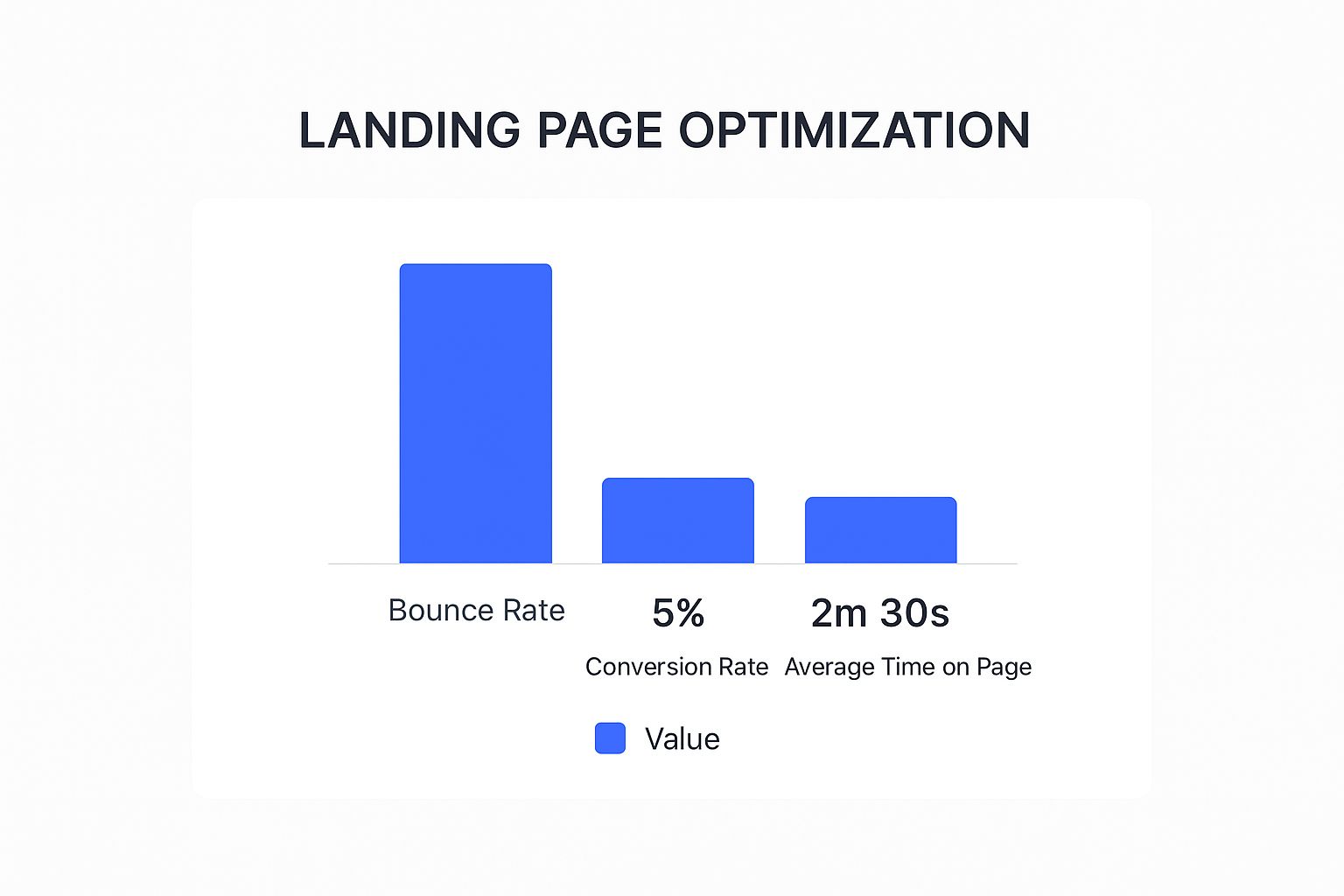
It gives you a solid performance baseline, showing how things like bounce rate and time on page directly impact your conversion rate.
Dedicated Landing Page Builders
If you’re an affiliate who values speed and conversion-focused features, a dedicated builder is probably your best bet. These platforms are designed from the ground up for one thing: getting people to click.
- Leadpages: A fantastic starting point for beginners. It’s known for being incredibly user-friendly and comes with a huge library of mobile-friendly templates. Perfect for getting a polished page online fast.
- Instapage: This one’s aimed more at teams and marketers who need serious performance. Its claim to fame is lightning-fast page speeds and sophisticated A/B testing tools.
- Unbounce: A true powerhouse for experienced marketers. Unbounce brings AI into the mix to help you fine-tune your headlines and layouts, making it ideal for running extensive tests to maximize your results.
Expert Tip: The "best" tool isn't the one with the most bells and whistles. It's the one that fits your skill level and budget. A simple, affordable tool you actually use will always beat a complex, expensive one that just sits there.
To help you decide, here's a quick look at how some of the top landing page builders stack up against each other.
Comparison of Popular Landing Page Builders
Ultimately, your choice depends on balancing features with your budget and how deep you plan to go with optimization.WordPress Plugin Options
Already running a site on WordPress? Great. Using a plugin is a super convenient and often cheaper way to go. You can build and manage everything from the WordPress dashboard you already know.
Two of the biggest names here are Elementor and Thrive Architect. Both provide a visual, drag-and-drop experience that lets you escape the standard WordPress editor and design with total freedom. They’re also loaded with templates and widgets specifically for affiliates, designed to grab attention and get those clicks.
And once you’ve built your page, you'll need a simple way to create and track your affiliate links. A good referral link generator is essential for keeping everything organized and making sure you get credit for your sales.
Testing and Optimizing for More Commissions
https://www.youtube.com/embed/vV3g5VuSrIQ
Hitting "publish" on your affiliate landing page isn't the finish line. Honestly, it’s just the starting gun. The people who really crush it in affiliate marketing are the ones who are constantly testing, tweaking, and refining their pages to squeeze out every possible conversion. This isn't about random guesswork; it's about using simple data to make smart changes that put more money in your pocket.
The easiest way to get started is with A/B testing, which you might also hear called split testing. It sounds technical, but it’s not. All you’re doing is creating two versions of your page (Version A and Version B) to see which one gets better results. The trick is to only change one thing at a time—like the headline or the button color. You send half your traffic to one page and half to the other, and let the numbers tell you which one wins.
What to Test First for the Biggest Wins
You could drive yourself crazy trying to test every single pixel on the page. Don't do that. Instead, focus on the big-ticket items that have the most influence on whether someone clicks your affiliate link.
Here’s where I always start:
- The Headline: This is your first impression. Try a clear, benefit-focused headline against one that sparks a little curiosity. For example, you could test "Manage All Your Social Media in Just 10 Minutes a Day" against something like, "The Social Media Shortcut Top Marketers Are Using."
- The CTA Button: The words and color of your button can make a surprising difference. Test a direct command like "Get Instant Access" against a more value-oriented phrase like "Start My Free Trial." Sometimes a simple color change from blue to a bright, contrasting orange can lift conversions.
- Your Main Image or Video: Are people responding better to a polished, professional photo or a short video showing the product in action? Visuals trigger emotions, so finding the right one is a huge lever you can pull.
Once your page has seen a little traffic, it's time to dig into the data. Pretty much any landing page builder will show you your conversion rate. This is the single most important number you need to watch—it's simply the percentage of visitors who click your affiliate link.
If Version A converts at 3% but Version B hits 5%, you've found a winner. It's that simple. You then make Version B the new default and start another test.
Optimization is never a one-and-done task. It’s a continuous cycle. A tiny 1% bump in conversions might not sound like a big deal, but when you're sending thousands of visitors to a page, it can dramatically increase your affiliate income over time.
For a deeper look into why people aren't converting, I highly recommend using a heatmap tool. Services like Hotjar or Microsoft Clarity (which has a great free plan) will visually show you where people are clicking, how far down the page they actually scroll, and which sections they completely ignore.
If you see that 90% of your visitors never scroll past the first screen, that's a massive red flag. It tells you your intro isn't compelling enough to get them to keep reading.
When you combine straightforward A/B testing with the behavioral insights from heatmaps, you create a powerful feedback loop. You make an informed change, measure the impact, learn from what happened, and do it again. This is how you turn a static, one-dimensional page into a dynamic machine that consistently generates commissions.
Answering Your Top Affiliate Landing Page Questions
If you're diving into affiliate marketing, you've probably got a few questions about landing pages. It's totally normal. Let's walk through some of the most common things people ask when they're getting started.
Can I Just Reuse the Same Landing Page for Different Offers?
I get why you'd ask this—it sounds like a great way to save time. But honestly, it's one of the biggest mistakes you can make.
Think about it: the whole point of a high-converting landing page is to speak directly to one person about one problem and offer one solution. When you try to make a generic page work for multiple products, you end up with a watered-down message that doesn't really connect with anyone. Your conversion rates will plummet. Always, always create a unique landing page for each specific offer.
The best affiliate marketers I know treat every single landing page like its own mini-business. It has one job: to convince a visitor to take action on that specific offer. That's it.
Do I Actually Need a Full Website for This?
Nope, you don't! While having a full website is a fantastic asset for building a brand over the long haul, it's not a requirement to get started with affiliate landing pages.
You can use dedicated landing page builders like Leadpages or Unbounce to build, publish, and host your pages without ever touching a traditional website. This is the perfect approach when you're running paid ad campaigns straight to an offer and need to get something up and running fast.
What's a Realistic Budget for a Landing Page?
This is the classic "it depends" answer, but I can give you some solid guideposts. The cost can swing from practically free all the way up to hundreds of dollars a month.
- On a budget? If you're using WordPress, a page builder plugin like Elementor has a powerful free version that's more than enough to get started.
- Ready to invest? Dedicated platforms that handle everything for you typically start in the $40 to $100 per month range.
My advice? Start with a tool that fits your current budget. Focus on proving that your affiliate offer can be profitable first. Once the money starts coming in, you can always upgrade to a fancier tool with more bells and whistles.
Ready to manage your affiliate program with ease? LinkJolt gives you the tools to track links, automate payouts, and scale your partnerships. See how it works at https://linkjolt.io.
Watch Demo (2 min)
Trusted by 300+ SaaS companies
Start Your Affiliate Program Today
Get 30% off your first 3 months with code LINKJOLT30
✓ 3-day free trial
✓ Cancel anytime